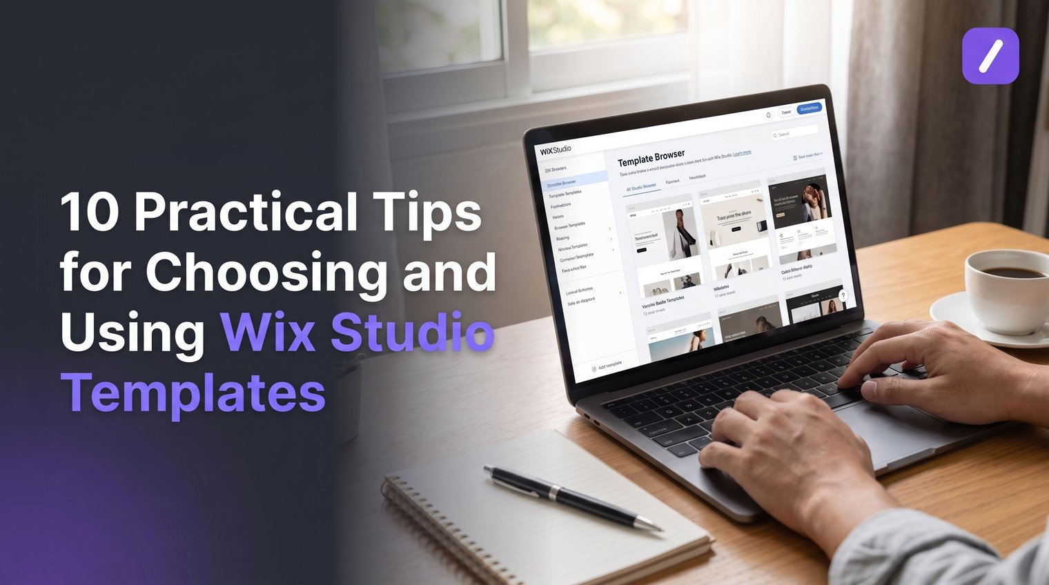
A polished demo can hide an expensive mistake. The wrong Wix Studio template may look right on day one, then fight your content, mobile layout, product catalog, or client workflow for weeks.
The smarter approach is to choose for structure first and style second. These practical checks will help you narrow the Wix Studio template library, avoid unnecessary rebuilding, and launch a site that works beyond its first impression.
1. Confirm that Wix Studio fits the project before choosing a template
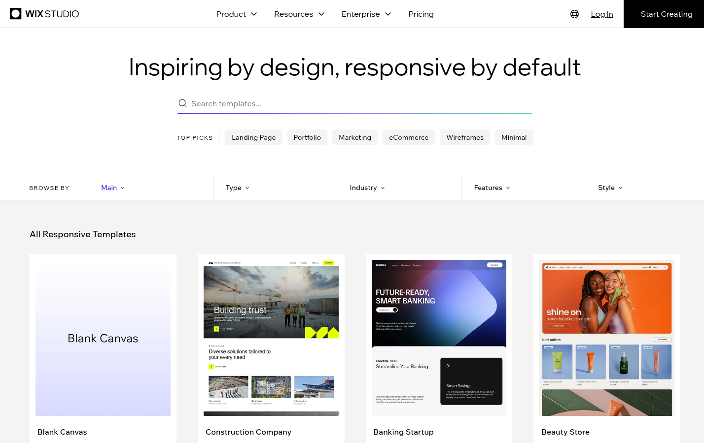
Yes, Wix Studio has templates. Its selection includes free starter templates, wireframes, and paid options available through the Marketplace. But selecting a template before deciding whether Wix Studio is the right platform puts the process backwards.
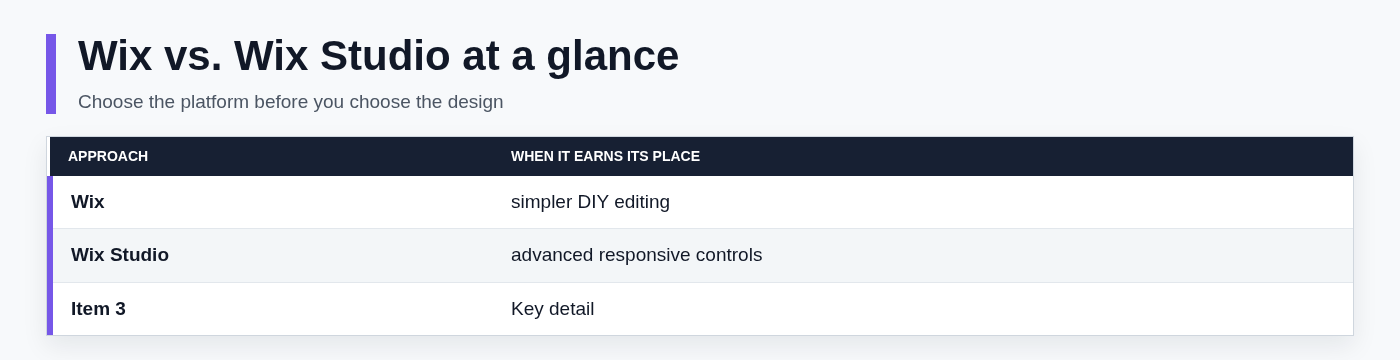
Standard Wix and Wix Studio serve different working styles. Standard Wix is generally the simpler choice for a DIY business owner building and maintaining one relatively straightforward site. Wix Studio is geared more toward freelancers, agencies, and experienced builders who need advanced responsive controls, client collaboration features, and a workflow that can scale across projects.
For a client-facing portfolio, a multi-page service site, or a project requiring careful breakpoint control, Wix Studio can be a strong fit. If the site owner wants the least technical editing experience possible, though, the standard Wix workflow may be more practical.
Make that platform decision before you fall in love with a homepage design. A template cannot compensate for a platform that does not match the team's skills, maintenance capacity, or business model.
2. Start with the site's conversion goal, not its visual style
Every site needs a primary job. It may need to book discovery calls, sell products, capture leads, showcase work, publish useful content, or establish credibility before a buyer gets in touch. Write that job down before opening template previews.
A conversion goal determines the pages and sections you need. A consultant who wants booked calls needs a clear offer, proof, service details, FAQs, and a frictionless inquiry path. An online store needs product categories, product-detail pages, cart and checkout behavior, shipping information, and policies. A portfolio needs enough room for focused case studies, not just a large image gallery.
Create a short checklist that includes required pages, critical features, and the action a visitor should take. For example:
- Service business: home, services, about, testimonials, contact, and a booking or inquiry flow.
- Creative portfolio: project categories, individual case studies, client context, outcomes, and a prominent contact route.
- eCommerce site: collection pages, product pages, cart, checkout requirements, shipping details, returns, and customer support information.
- Content-led business: blog categories, author or expertise pages, email capture, searchable content, and internal navigation.
This takes ten minutes and saves hours of trying to force the wrong layout into the right business.
3. Filter Wix Studio templates by industry - but judge the underlying page structure
Industry filters are useful for reducing a large template library. A restaurant template may already include menus and reservation prompts; a service-business design may include pricing and testimonials; Wix Studio eCommerce templates often begin with the product and collection structure that a store needs.
Still, industry labels are only a starting point. Do not choose a template because its stock photography is excellent or its demo brand happens to match your aesthetic. Demo imagery is easy to replace. Weak navigation, missing conversion paths, and an awkward page hierarchy are not.
Review the actual structure: the navigation depth, number of useful pages, placement of calls to action, section patterns, and whether key information can be found without excessive scrolling. Look for reusable blocks that will support the whole site, such as testimonials, feature comparisons, FAQs, team profiles, and contact panels.
For Wix Studio portfolio templates, prioritize how work is organized. Can visitors filter projects sensibly? Does each project have a case-study layout with room for the problem, process, deliverables, and result? Are images treated well at different sizes? Most importantly, does the portfolio give a qualified prospect a clear next step to inquire?
4. Test responsive behavior before you commit to a layout
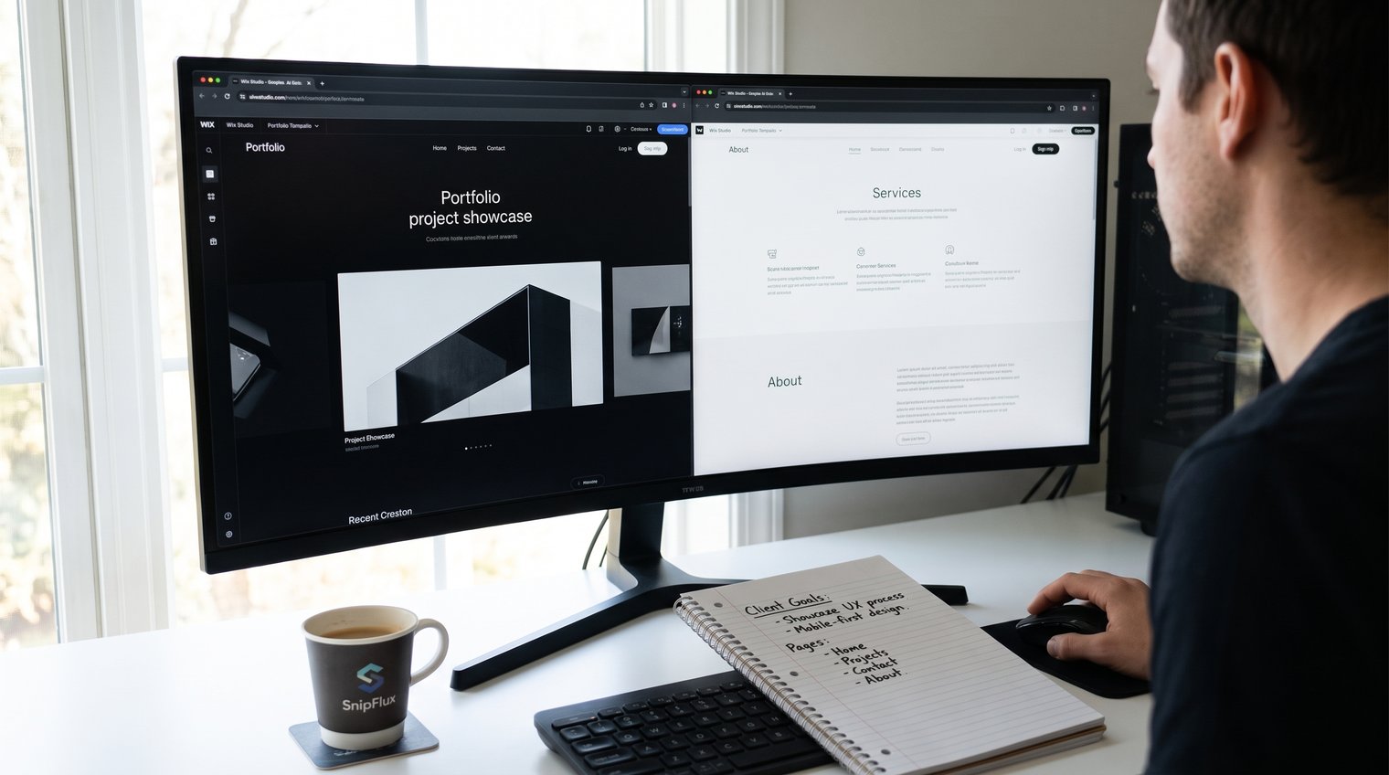
Desktop previews are seductive and incomplete. A template should be judged across desktop, tablet, and mobile breakpoints before you commit to its structure.
Pay special attention to the pieces that often break when content becomes real: overlapping text, long headlines, wide comparison tables, image galleries, sticky headers, layered sections, animations, and multi-column layouts. A three-column feature block may look clean in a template preview, then become cramped when your service names are longer than the demo copy.
The best template is not necessarily the most elaborate one. It is the one that needs the fewest structural corrections across screen sizes. That leaves more time for the content, proof, and user journey that actually persuade visitors.
Use realistic test content while evaluating layouts. Add a long project title, a descriptive product name, or a real testimonial. If the design only works with short placeholder copy, it is not as flexible as it appears.
5. Compare free, premium, and Marketplace templates by total effort
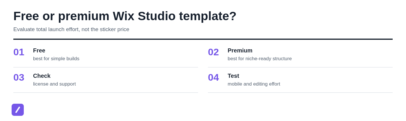
Free Wix Studio templates are often enough for a straightforward brochure site, a small portfolio, or a simple service business. They make sense when you have solid design judgment, time to customize carefully, and no need for specialized workflows.
Premium Wix templates and Marketplace options can be worth buying when they offer genuinely useful information architecture, niche-ready components, or a faster route to launch. A well-built template for a photographer, hospitality business, coach, or store may save substantial work if its page structure closely matches your requirements.
Do not judge the decision by the purchase price alone. A free template that requires twenty hours of restructuring is not necessarily cheaper than a paid template that is 80 percent ready. Before you buy a Wix Studio template, inspect the following:
- Update history: A template should not feel abandoned or built around outdated practices.
- Documentation: Clear setup guidance matters when the template includes custom components or content collections.
- License terms: Confirm how and where the template may be used, especially for client work.
- Support: Know whether the creator offers help and what that help covers.
- Mobile behavior: A polished desktop preview is not proof of a usable mobile experience.
- Editing effort: Estimate how much needs changing after the purchase, not just how attractive the starting point is.
6. Audit the template's components, CMS needs, and integrations
A template should support the content model your business needs, not merely display a homepage well. Check early whether the project requires CMS collections, dynamic pages, blog posts, events, bookings, memberships, product catalogs, or searchable resource content.
For example, a property site, directory, agency portfolio, or team site may benefit from repeatable content collections and dynamic pages. Building every item manually can be manageable at first, but becomes a maintenance problem as the site grows. Conversely, do not add a CMS just because it sounds advanced if the business will only ever have five static pages.
Separate essential functions from decorative extras. Too many apps, widgets, animated effects, and embedded tools can create slower pages and more maintenance points. Every addition should answer a clear visitor or operational need.
For Wix Studio eCommerce templates, go deeper than the homepage. Review product variants, collection navigation, product-detail-page layouts, shipping requirements, tax setup, payment availability, and the checkout experience. A beautiful storefront is irrelevant if the store cannot handle how customers actually buy.
7. Preview performance and accessibility before adding your brand assets
Templates make publishing easier, but they can also encourage bloat. This is one of the real downsides of a visual website builder: it is easy to keep adding sections, apps, video backgrounds, effects, and oversized assets until the experience becomes slow and distracting.
Before customization gets underway, inspect the basics. Check font sizes, color contrast, heading order, keyboard-friendly navigation, motion settings, and how alt text will be added to meaningful images. Accessibility should not be postponed until the end, when changing a low-contrast palette or confusing hierarchy is more expensive.
Be conservative with auto-playing video, heavy animation, huge image files, and third-party integrations. Use motion when it supports understanding, not as decoration. Compress and size images appropriately. Remove demo flourishes that do not help a visitor choose, contact, or buy.
Wix is a legitimate, established hosted website builder, but no platform removes the need for good implementation decisions. Review plan terms, data practices, payment requirements, connected apps, and the practical implications of platform lock-in before committing to a long-term build.
8. Customize the design system first, then replace content section by section
Do not begin by rewriting random blocks on the homepage. Start with the design system so the site looks coherent from the first page to the last.
A safer editing order is to duplicate or stage the template, set global colors and typography, establish button styles and spacing rules, then update pages and individual sections. This prevents the common problem of a site that contains five slightly different button treatments, inconsistent heading sizes, and uneven margins because every page was edited in isolation. For freelancers and client-facing teams, keeping approved inquiry replies, project updates, and calls to action in a reusable library can also make repeated launches easier to manage.
Preserve responsive rules while you make changes. Before deleting an element, understand whether it connects to CMS data, global components, navigation, or another page. A quick visual cleanup can accidentally remove something that appears elsewhere or supports an important path.
Replace all inherited material before launch: demo copy, images, captions, page titles, metadata, placeholder links, legal references, and calls to action. A real brand should not go live with a generic "Get Started" button that leads nowhere or a testimonial that still refers to the template's fictional company.
9. Use a short pre-launch review to catch template-specific problems
Template-based sites often fail in predictable, fixable ways: a menu item points to a demo page, a mobile form is hidden, a social-sharing image is missing, or an empty section remains below the footer. A short pre-launch review catches these problems before customers do.
Test the finished site on desktop and mobile. Check every navigation link, form, booking path, checkout route, favicon, cookie and privacy pages, SEO title, social-sharing image, and analytics implementation. If the site sells products or accepts inquiries, complete the process as a visitor would.
Then do a content-quality pass. Remove duplicate demo pages, empty sections, generic calls to action, unoptimized media, inconsistent tone, and any language that does not sound like the business. A template provides a layout; it does not provide a finished message.
Finally, assign a real customer task. Ask someone to find a particular service, locate a portfolio project, submit an inquiry, or complete a purchase without guidance. Watch where they hesitate. That feedback is more useful than another round of internal opinions about colors.
10. Know when to switch builders instead of forcing a Wix Studio template to fit
There is no universally better website builder than Wix. The best choice depends on what the business needs to operate: its technical requirements, content volume, commerce model, budget, and the people responsible for maintaining the site.
Wix Studio
Wix Studio is a sensible option for design-conscious service sites, portfolios, and agency workflows that benefit from more advanced responsive control.
Shopify
Shopify is often the stronger choice for commerce-first operations where the store is the business and product, inventory, and selling workflows take priority.
WordPress
WordPress can suit organizations that need extensive publishing flexibility and a broad plugin ecosystem.
Squarespace
Squarespace is a good fit for simpler, design-led sites with less demand for advanced customization.
GoDaddy
GoDaddy can work for a basic site that needs to get online quickly, but it is not automatically better than Wix or Wix Studio. It is a speed-to-launch choice for certain simple needs, not a feature-for-feature replacement.
Likewise, Wix versus Shopify is not a general popularity contest: Shopify is usually the more focused option for serious retail operations, while Wix can be more flexible for a broader business website with lighter commerce needs.
If a Wix Studio template requires continual workarounds for essential functions, take that seriously. Rebuilding early is cheaper than carrying a poor platform fit through launch, marketing, and future updates.
Choose the template that reduces rework - not just the one with the best demo
The right decision sequence is simple: confirm platform fit, define the conversion goal, assess page structure, test responsiveness, compare total effort, verify technical needs, and run a disciplined pre-launch check.
When you manage repeated website launches or client communications, save approved calls to action, inquiry replies, signature blocks, and client-update templates in SnipFlux. Reusing clear, approved language keeps the work moving without rewriting the same messages for every project.
Choose the template that makes the real site easier to build, maintain, and use. The demo is only the starting point.